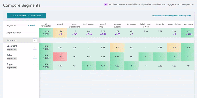
The ability to slice and dice the analysis from EngageRocket is one of the most useful ways to dive deeper into your data to understand the pockets of strengths and opportunities within your organisation. EngageRocket’s compare segment tab presents the data in a heatmap format and just like a weather map, it is a great starting point because, at one glance, you will see where the hot spots are, where support is needed and where sources of best practices lie.
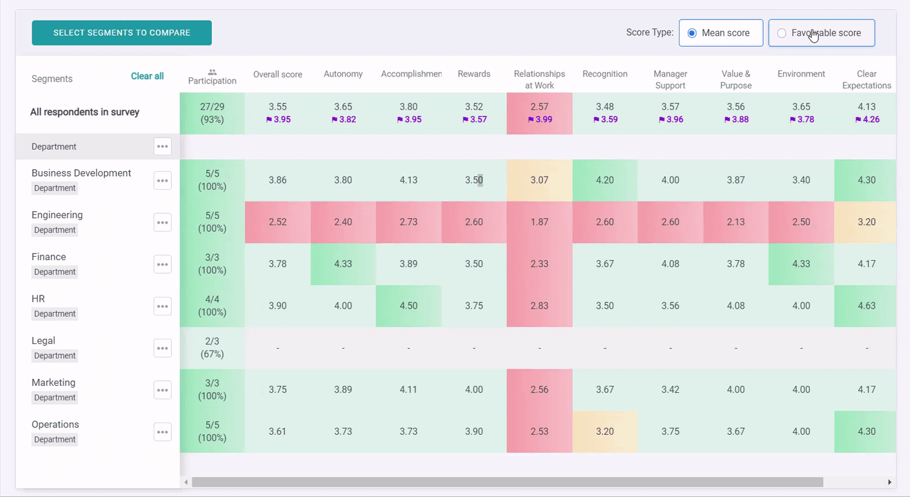
When you arrive at the Compare Segment tab, click “Select Segments to Compare” in the top left-side menu and choose the pre-set attributes you’d like to view data for. You can dive even deeper by adding an additional segment layer, on top of the original segment.
For example, you have selected the department segment to view how different departments in your organisation have performed and you would like to dive deeper into every department segment and see how various age groups are performing for every department segment. Simply click on the “3 dots” icon next to the department, and select “View segments within this segment”, a pop-up will appear (as shown in the image above). You can then select a second layer segment e. g. Age Range (as illustrated in the image above) and see the changes reflected on the screen. To remove all selections, you may simply click on "Clear all". Click on the driver itself to expand into the questions within the given driver.
To ensure that you can maximise the potential of this feature, please ensure that you have set up your organisation's attributes correctly.
Benchmark scores are conveniently available to you in purple for all standard EngageRocket driver questions. These are the aggregated average of all responses received by the standard EngageRocket driver questions in the last 1 year across all companies and surveys.
You can also view the compare segments page by favourable scores. This can be easily toggled with the radio buttons.
If you wish to share your analysis, simply click “Download compare segment results (.xlsx)” to download the results. You may choose to download the results represented by favourable score or mean driver score. Do note that this export is for the current view only.
What do these colours mean?
At first glance, it may look like a full page of numbers but don't fret! The data is presented in a heat map, and it works just like a weather map. The colours are based on the score’s percentage calculated against the maximum available score. The maximum available score depends on the survey settings.
For example, assuming your survey uses a 1 to 5 point scale, this percentage calculation translates into average (mean) scores as follows:
- <50% (i.e., mean score less than 3.0) is represented in Red: Just like the "red zones" in a weather map represent bad weather, red fields in the heat map indicate areas that may require immediate attention within your organisation.
- 50% to 60% (i.e., mean score between 3.0 and 3.4) is represented in Amber (Yellow): Amber fields serve as early warning signals! These areas may indicate potential issues that need monitoring.
- 60% to 80% (i.e., mean score between 3.4 and 4.2) is represented in Light Green: Light green fields show generally positive sentiments and healthy areas in your organisation.
- >80% (i.e., mean score greater than 4.2) is represented in Dark Green: Dark green fields are excellent and indicate areas where best practices may be found.
This breakdown helps you interpret the heat map easily and understand how the colours relate directly to the average scores your respondents provide.
Tip: If you see a vertical red or yellow line, that would suggest an organisation-wide problem for that particular driver!
If you see a horizontal red or yellow line, that would mean the problem is local to that attribute (e.g. particular manager or department).
For any questions, send an email to our responsive support team at support@engagerocket.co We're here to assist you every step of the way!