
⚠️ Who is this article for? This guide is for Entity Admins and users with dashboard access who want to analyse survey results by employee segment. If you cannot see the Hotspots tab on your dashboard, your access level may be restricted — see Understanding your dashboard access level.
The Hotspots tab helps you quickly identify where your organisation is performing well and where there are areas for improvement, broken down by employee segment. Instead of reviewing every question manually, the Hotspots chart surfaces patterns at a glance — making it easy to focus your attention where it matters most.
💡 Where to find it: Navigate to your survey from the Survey Projects section, then click the Hotspots tab on the dashboard. See how to navigate the survey dashboard overview if you need help getting there.
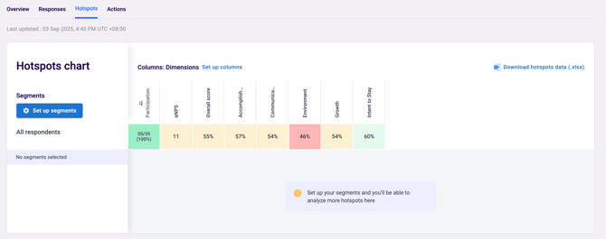
Reading the Hotspots Chart
The chart displays scores across dimensions, eNPS, participation, and overall scores, broken down by your organisation's units or segments. Each cell is colour-coded to indicate performance — green or darker colours indicate stronger performance where scores are high, while red or orange colours indicate lower scores that may need attention or further investigation. Click on a dimension name to expand or collapse the individual questions underneath it, giving you question-level detail when you need it.
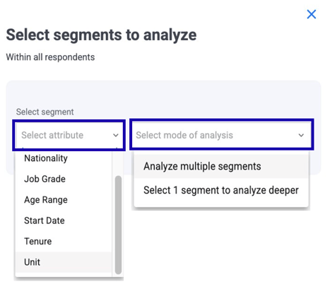
Selecting Segments for Targeted Analysis
The real power of the Hotspots tab comes from the Segment Selection feature, which lets you customise your analysis to focus on specific employee groups. On the Hotspots page, find the Segment Selection panel and select an attribute to analyse — for example, department, nationality, job grade, age range, start date, or tenure. Then choose your mode of analysis: select Analyse multiple segments to compare different groups side by side, or Select 1 segment to do a deeper dive into one specific group. The chart will update automatically to show results for your selection.
💡 Good to know: Segment selection helps you move from broad comparisons to targeted insights — for example, comparing results across all departments, or zooming into a single team to understand their experience in more detail.
What to Look For
When reviewing your Hotspots chart, focus on a few key patterns. Consistently low scores across multiple dimensions for the same segment may indicate a team or group that needs specific attention. A dimension that is low across all segments suggests an organisation-wide issue rather than a team-specific one. Blank cells or dashes appear when a segment has fewer respondents than the confidentiality threshold — results are hidden to protect confidentiality.
See what is the confidentiality threshold and why can't I see results?
Something Not Working?
The Hotspots tab is not visible on my dashboard.
- Likely cause: Access to the Hotspots tab requires specific dashboard permissions that may not be enabled for your account.
- Action: Ask your Entity Admin to check your dashboard access settings. See Understanding your dashboard access level.
Some cells in the Hotspots chart are blank or show dashes.
- Likely cause: Those segments have fewer respondents than the confidentiality threshold.
- Action: This is by design to protect respondent confidentiality and cannot be overridden. See what is the confidentiality threshold and why can't I see results?
I want to compare hotspots across two different surveys.
- Likely cause: The Hotspots chart shows results for one survey at a time.
- Action: For cross-survey comparisons, use the Trend Analysis chart on the Overview tab instead. See how to navigate the survey dashboard overview.
The segment I want to filter by is not appearing in the Segment Selection.
- Likely cause: The attribute may not have been populated in your Employee List.
- Action: Check that the relevant demographic field is filled in for your employees. See how to upload and edit your Employee List.
Still Need Help?
If you have questions about using the Hotspots chart, reach out to us at support@engagerocket.co and we'll be happy to assist!