
⚠️ Who is this article for? This guide is for users with dashboard access who want to understand and navigate the Survey Dashboard. If you cannot see the dashboard or certain tabs are missing, your access level may be restricted — see Understanding your dashboard access level.
The Survey Dashboard is where you view your survey results. The Overview tab gives you a high-level picture of how your survey is performing, from overall scores and participation through to trend comparisons and open-ended themes. Results are visible as soon as responses start coming in, so you can monitor progress while the survey is still running.
💡 Good to know: You can view dashboard results at any time — while the survey is live, or after it has closed. Results update in real time as responses are submitted.
Getting to Your Dashboard
After logging in, navigate to the Survey Projects section from the top navigation bar. Select the project and then the survey you want to view results for — you will land on the Dashboard Overview tab automatically. To switch between surveys, use the dropdown menus at the top of the page to select a different survey project or survey name, and results will update immediately.
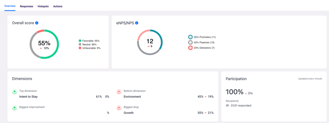
What You Will See on the Overview Tab
The Overview tab brings together the most important metrics in one place. Here is what each section shows:
Overall Score — the percentage of favourable responses (scores of 4 or 5) across all rating scale questions set to contribute to the overall score. This gives you a quick snapshot of how the survey is performing as a whole.
eNPS (Employee Net Promoter Score) — if your survey included an eNPS question, this shows how likely employees are to recommend your organisation as a place to work. Scores range from -100 to +100.
Top and Bottom Dimensions — highlights the strongest-performing dimension and the one needing the most attention, based on responses received so far. Useful for quickly identifying what is going well and where to focus.
Participation — shows the current response rate — the total number of responses submitted out of the total number of recipients. This updates in real time while the survey is live.
Trend Analysis
Scroll down on the Overview tab to find the Trend Analysis chart. This shows how your scores have changed across multiple surveys within the same project, giving you a visual history of progress over time. Use the dropdown at the top of the chart to switch between Overall Score, eNPS, or a specific Dimension. The x-axis shows the timeline of surveys (e.g. Pulse Survey January 2025) and the y-axis shows the percentage of favourable scores for the selected metric. Hover over any data point to see the exact score and respondent count for that survey period.
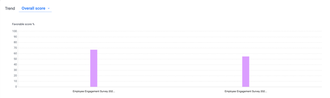
💡 Good to know: Trend data only appears when there are at least two surveys with responses within the same project. If you only have one survey, the trend chart will not yet have comparative data to display.
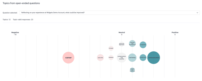
Topics from Open-Ended Questions
If your survey included open-ended questions, a bubble chart will appear below the trend analysis. This chart automatically groups employee responses into themes and shows sentiment at a glance. Bubbles on the right side represent topics with more positive sentiment, while bubbles on the left represent topics with more negative sentiment. Larger bubbles represent topics mentioned more frequently by employees. Use this chart alongside the detailed open-ended responses in the Responses tab for deeper context.
See how to view and analyse your survey responses.
Navigating Between Dashboard Tabs
The dashboard has three main tabs — use these to explore your results in more depth:
- Overview — high-level scores, trends, participation, and open-ended themes (this tab)
- Responses — detailed question-by-question breakdown, eNPS distribution, and open-ended answers. See how to view and analyse your survey responses
- Hotspots — visual heat map highlighting highest and lowest scoring areas by segment. See how to use hotspots for targeted insights
Something Not Working?
My dashboard shows no data even though responses have been submitted.
- Likely cause: Results may still be processing, or your account may not have dashboard access configured.
- Action: Allow a few minutes for results to process and refresh the page. If data is still missing, contact support@engagerocket.co with the survey project name.
I can see the dashboard but some tabs are missing.
- Likely cause: Specific tabs require certain permission settings that may not be enabled for your account.
- Action: Ask your Entity Admin to check your Dashboard Permissions. See Understanding your dashboard access level.
The trend chart shows only one data point.
- Likely cause: Trend data requires at least two surveys with responses within the same project.
- Action: Complete a second survey within the same project to enable trend comparisons.
I cannot find the survey I am looking for.
- Likely cause: You may be looking in the wrong project, or the survey may not have any responses yet.
- Action: Use the dropdown menus at the top of the dashboard to switch between survey projects and survey names.
Still Need Help?
If you have questions about navigating your survey dashboard, reach out to us at support@engagerocket.co and we'll be happy to assist!