
The Hotspots Page is where high-level data becomes actionable. Instead of viewing scores in isolation, this page helps you uncover disparities across teams or groups, surfacing the areas that need your attention the most.
Designed for visual clarity and powerful comparison, the Hotspots view enables leaders to focus efforts on the right places, at the right time.
Find Out What’s Working and What’s Not
In one glance, you can assess critical engagement indicators like overall score, eNPS, participation rate, and specific dimension scores (such as Work Environment, Leadership, or Growth). These are colour-coded to immediately show areas that are thriving in green, and those needing closer review in red or yellow.
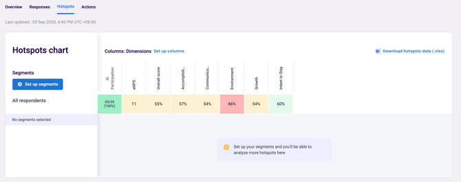
Instead of treating all teams equally, you can now make smarter, more targeted decisions—identifying which departments are doing well, which might be at risk, and where early intervention could make the biggest impact.
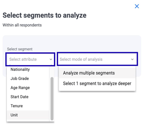
Dig Into Segment-Level Trends
The power of this page lies in comparison. Use it to explore how different segments are experiencing the workplace.
With Segment Selection in Hotspot, you can customize your analysis in two simple steps:
- Select Attribute, Choose the attribute you want to analyze, such as Nationality, Job Grade, Age Range, Start Date, Tenure, or Unit.
- Select Mode of Analysis by:
-
- Analyze multiple segments to compare different groups side by side.
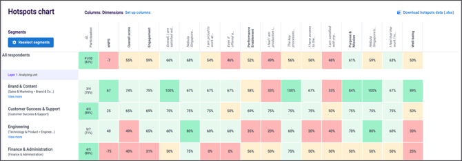
Whether you're looking at department, tenure, job grade, business unit, or custom attributes, the ability to slice your data in multiple ways reveals stories that top-line numbers can’t.
You may find, for instance, that while overall scores are strong, newer employees or a particular region may be facing challenges that require specific attention.
This flexibility helps you customize your data exploration from broad comparisons to deep dives making your analysis more relevant and actionable.
Expand or collapse the list of related questions by clicking on the driver's name. This interactive function allows you to toggle the question view on demand, providing immediate access to detailed questions-level insights when needed.
Heatmap & Coloring Logic
EngageRocket’s coloring logic is designed to give you clear, intuitive signals about how your teams are performing—whether you're looking at favorable scores or eNPS. With consistent visual rules, you can quickly spot strengths, identify areas for improvement, and interpret results with confidence.
How Coloring Works
Each score is assigned a color based on its value falling within specific cut-offs. These rules apply across:
-
Favorable scores (question, dimension, and overall)
-
eNPS scores
This ensures that the visual cues remain consistent across different types of metrics.
Coloring Rules
The following table shows the cut-offs and corresponding colors:
| Favorable Score (question, dimension, overall) | eNPS | Color Code |
|---|---|---|
| score ≥ 80% | eNPS score ≥ 60 | Mint Green |
| 60% ≤ score < 80% | 20 ≤ eNPS score < 60 | Pale Mint |
| 50% ≤ score < 60% | 0 ≤ eNPS score < 20 | Soft Yellow |
| score < 50% | eNPS score < 0 | #Light Red |
-
Green tones
Indicate positive results or strong performance, with darker green representing the highest performing segments. -
Yellow tone
Highlights areas that are neutral or borderline—worth reviewing, but not necessarily problematic. -
Red tone
Signals areas that require attention, whether due to low favorability or negative eNPS.
Consistent color logic helps you instantly understand performance trends, compare teams or dimensions at a glance, and quickly identify areas that need attention. It supports clearer, more confident decision-making by making data easier to interpret. With these color cues, your dashboards become more intuitive and your insights more actionable—empowering you to drive meaningful change across your organisation.
With these color cues, your dashboards become more intuitive and your insights more actionable—empowering you to guide meaningful change across your organisation.
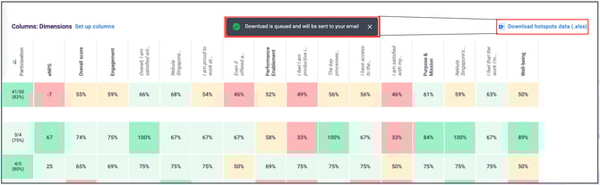
Export with Ease
Need to share these insights with others? Download the full dataset by clicking “Download (Excel)” at the top-right corner of the page. A detailed file will be emailed to your inbox, giving you a team-by-team view ready for further analysis or reporting.
From Insight to Action
The Hotspots Page isn’t just about identifying issues, it’s about prioritising what matters. With the right insights, you can focus your time and energy where it will have the greatest return: supporting struggling teams, replicating successful practices, and tracking progress across different groups over time.
When used effectively, this page becomes a strategic compass, guiding how you lead, engage, and support your people.
If you have any questions or need further assistance, feel free to reach out to us at support@engagerocket.co We're here to help!